Nice idea and well executed. Your second example shows the best side of the font.
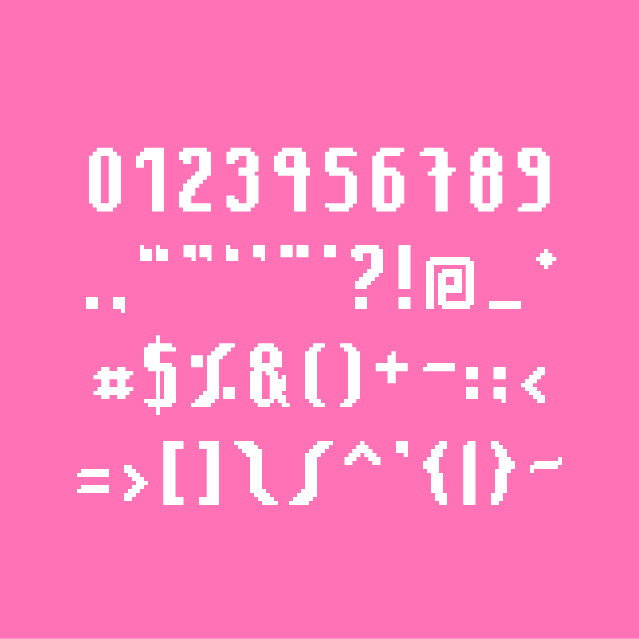
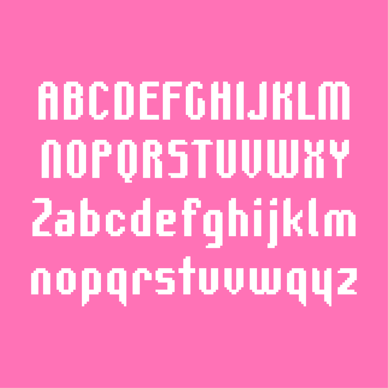
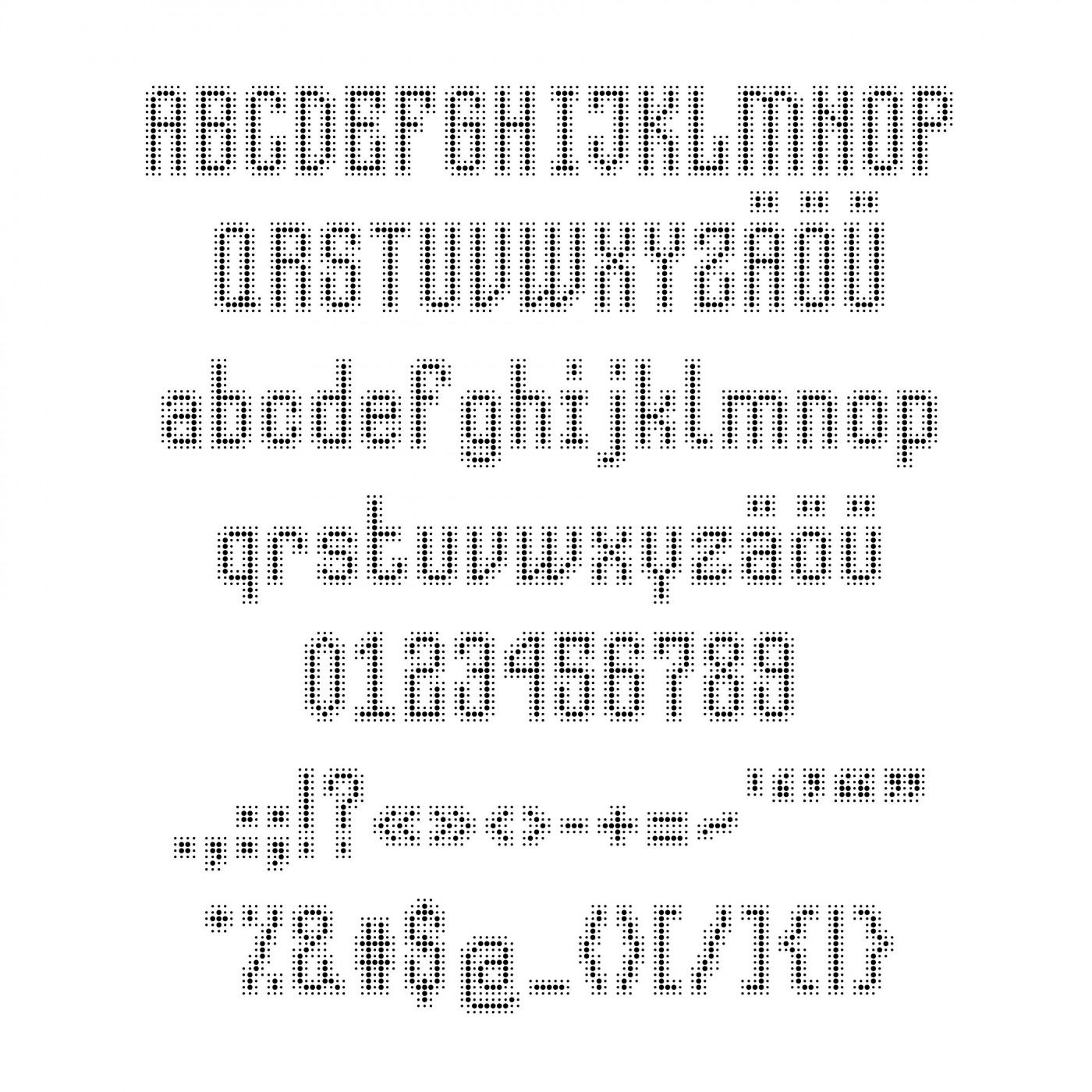
I love your glyphs what
luas.
The following changes have been made: the J and M were redesigned, to the N ink traps were added, and the R, x, Ø, ø were modified. The position of diacritical
I cannot unsee Ralsei from the Dark World...




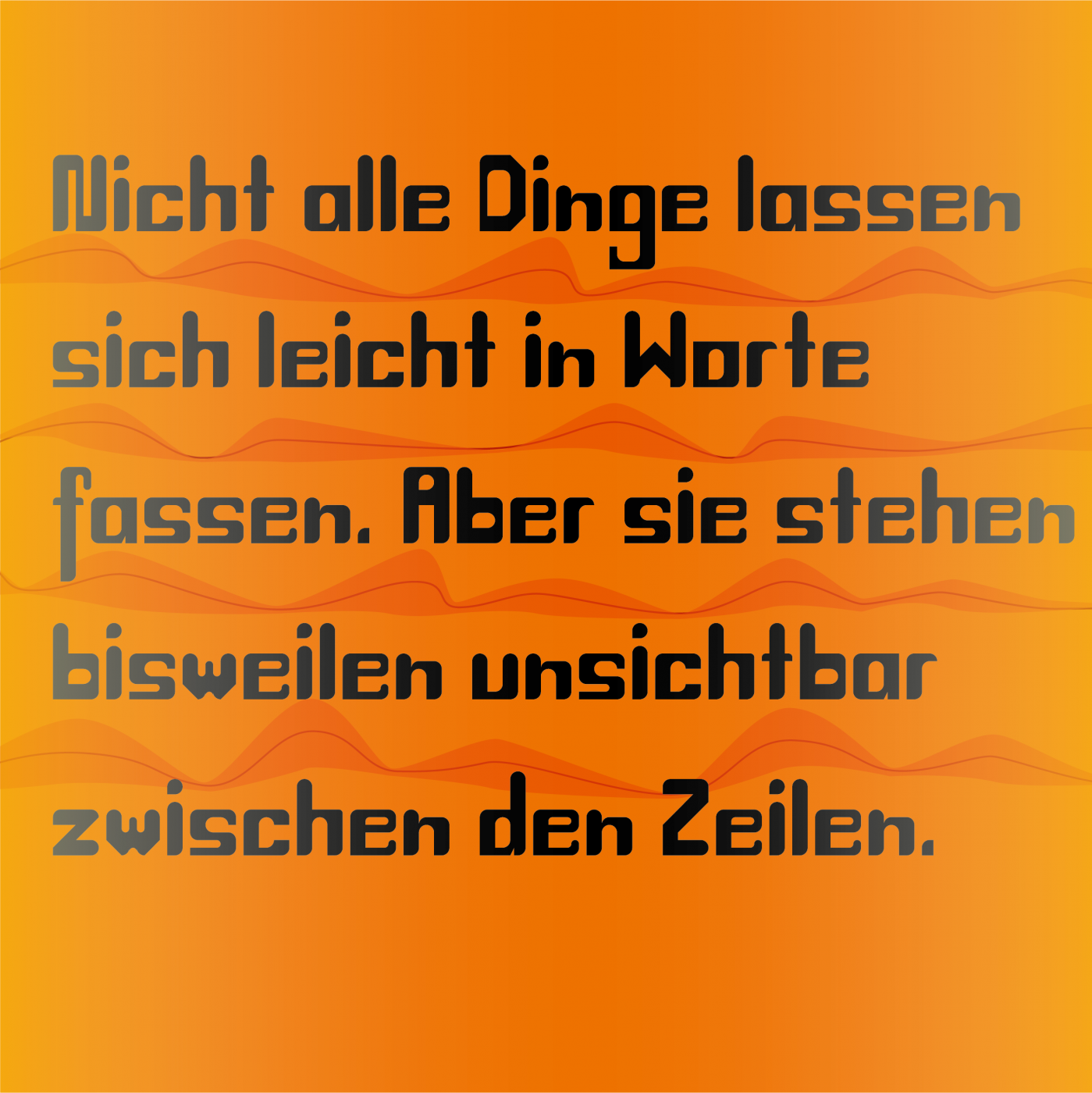

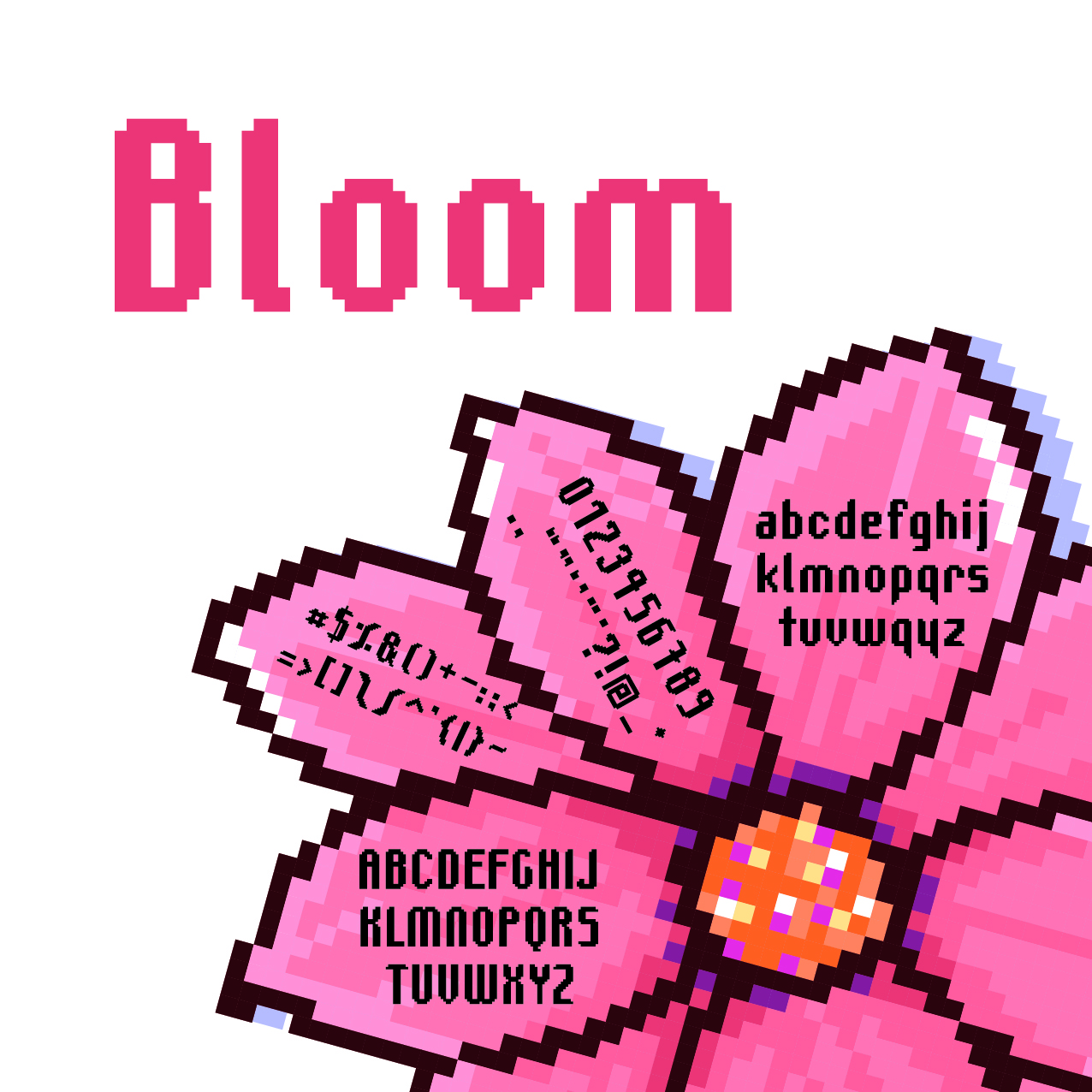

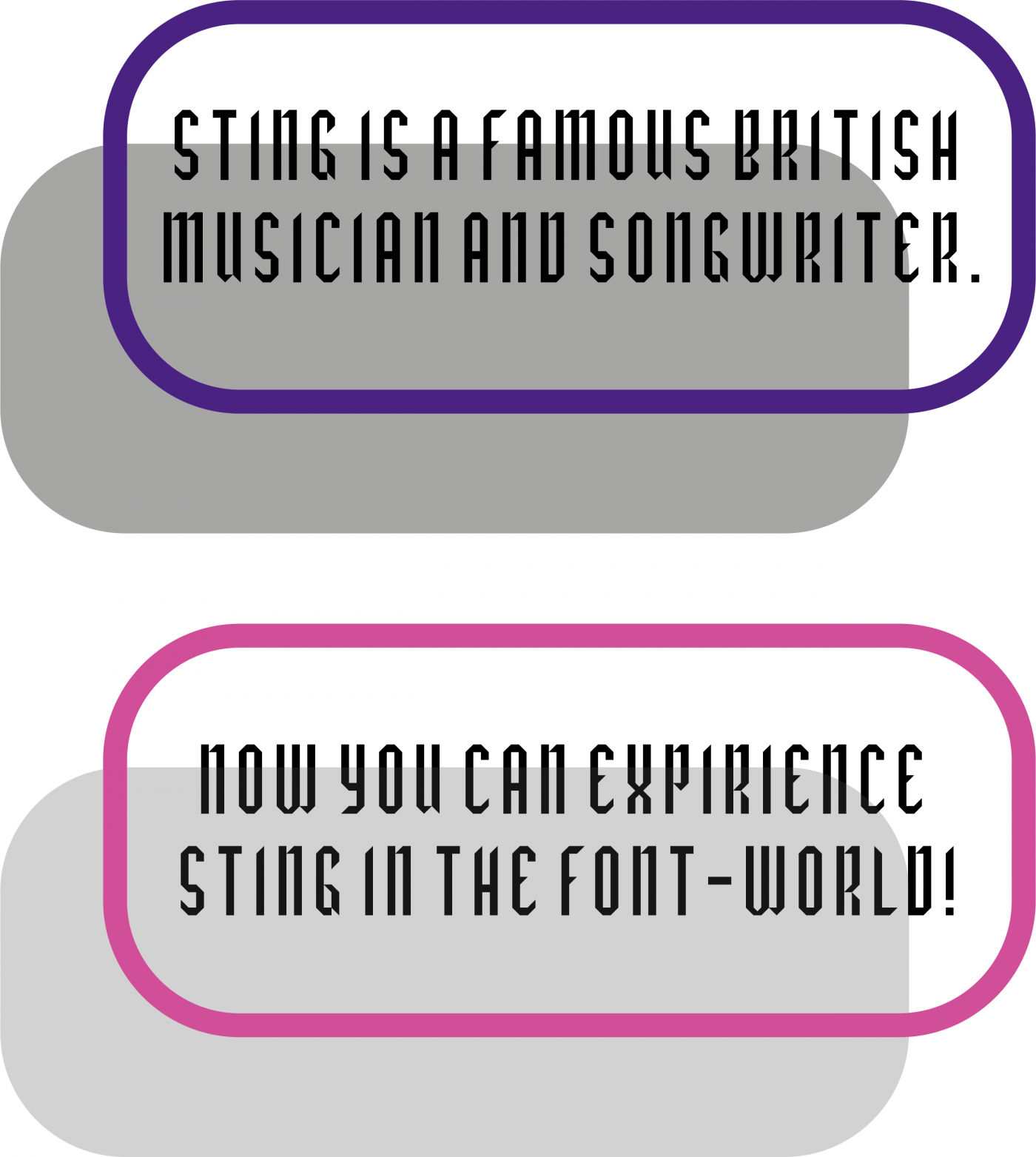
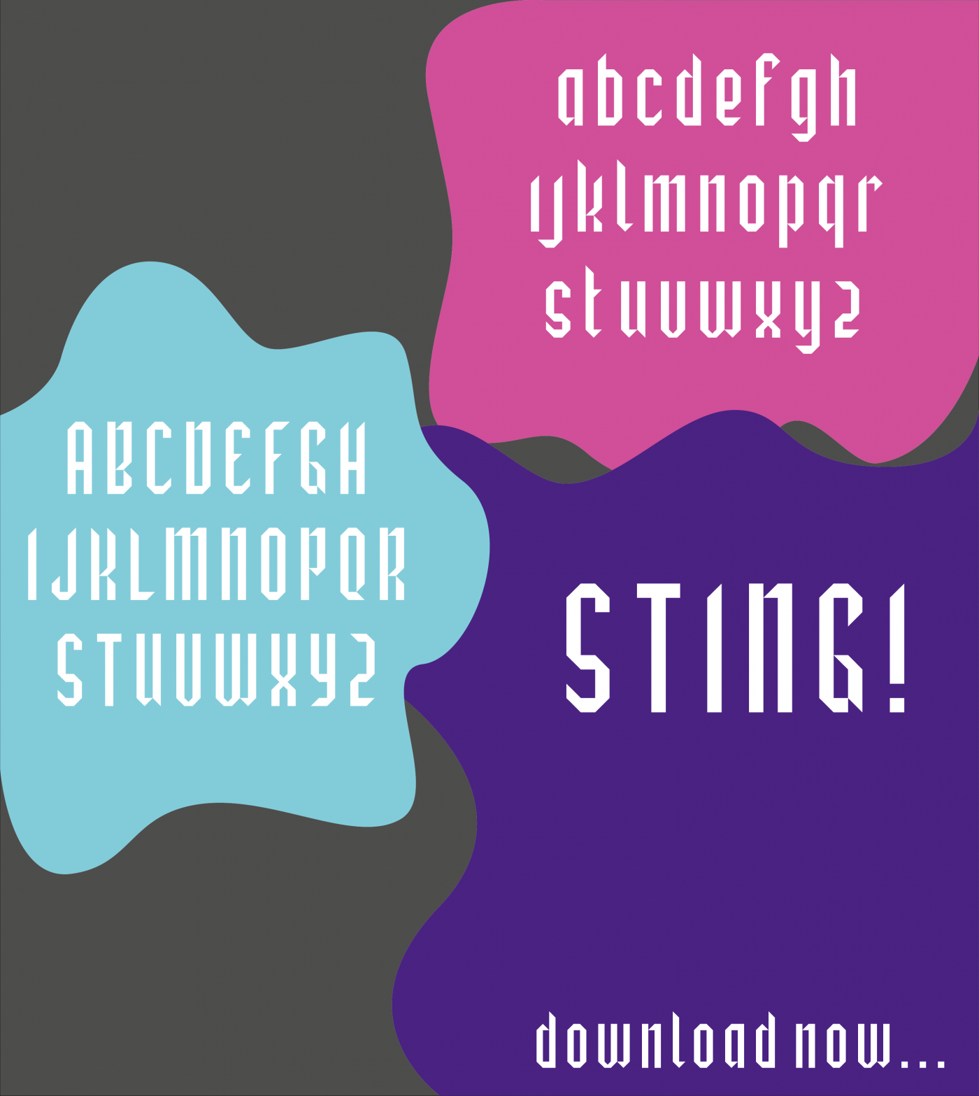
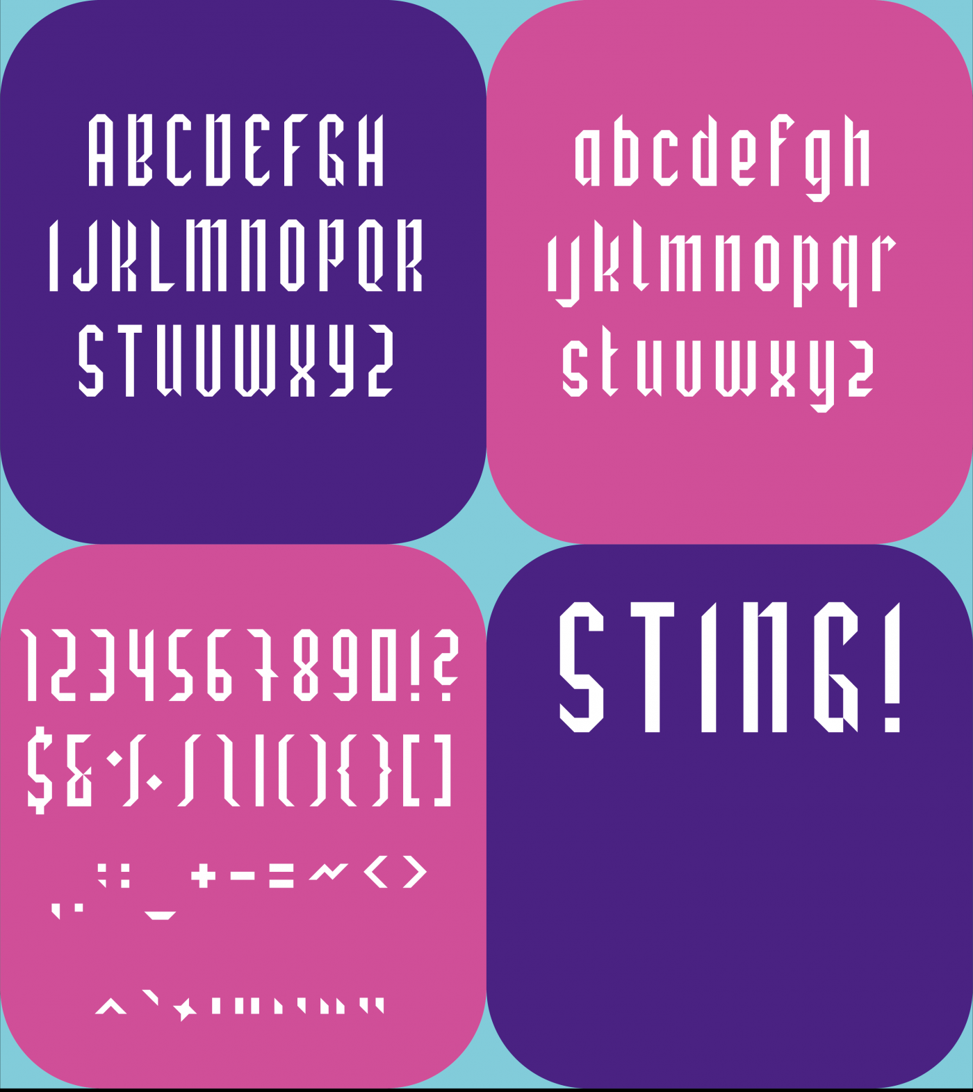

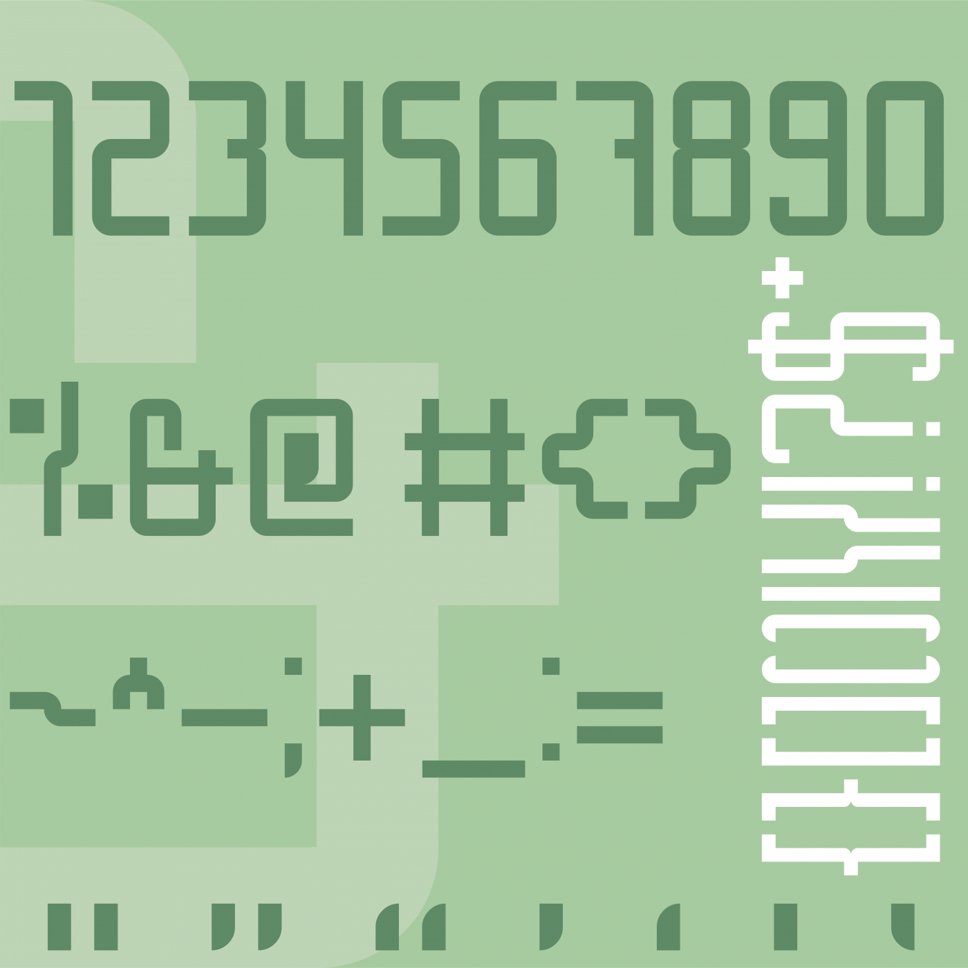
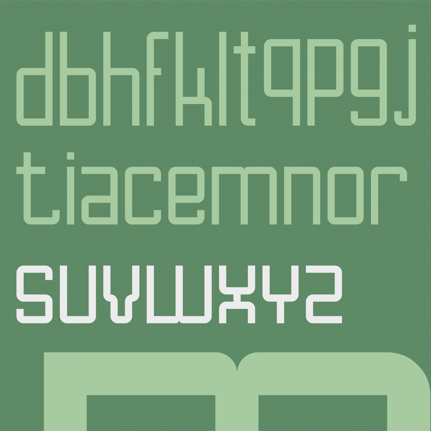
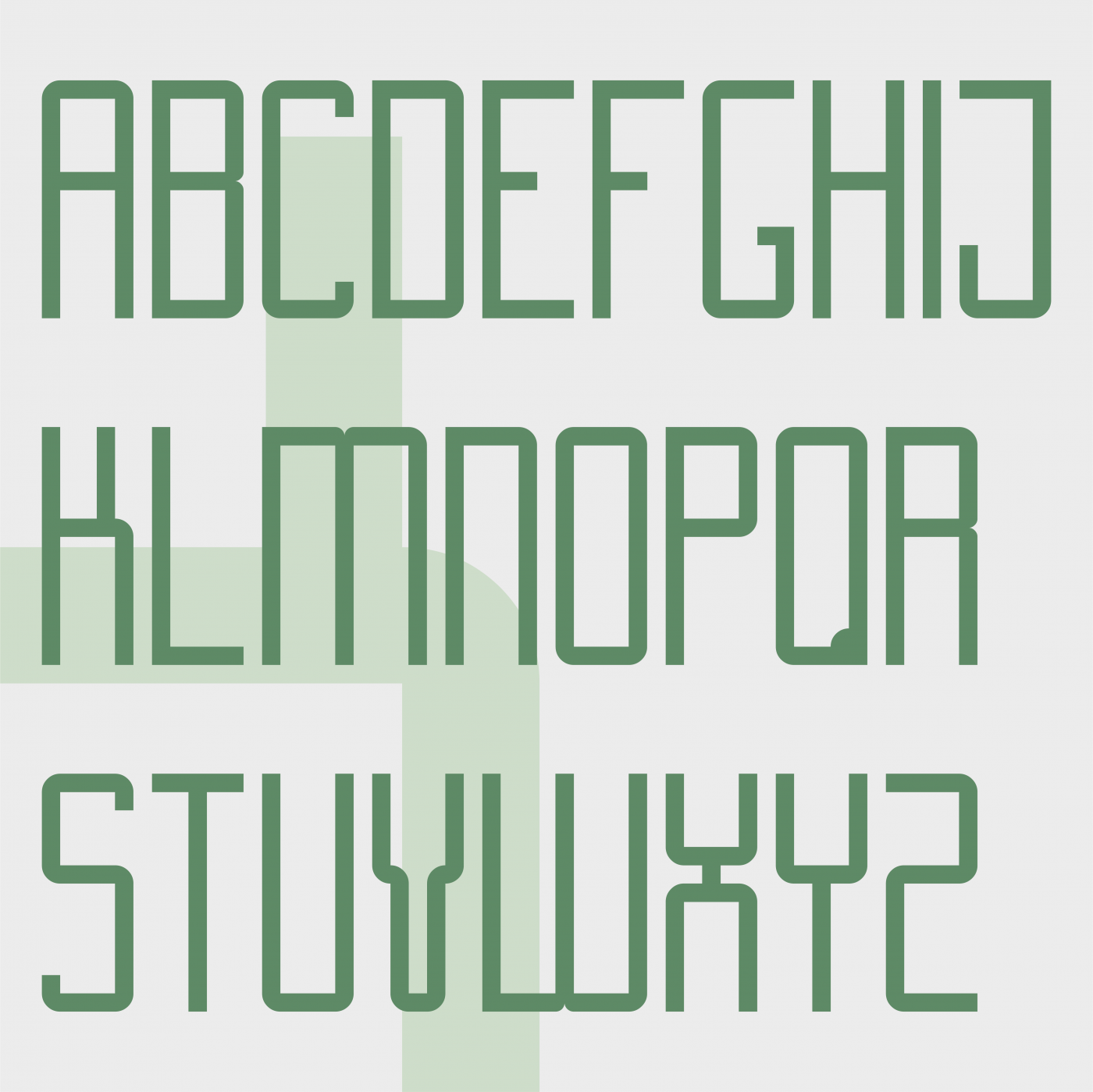

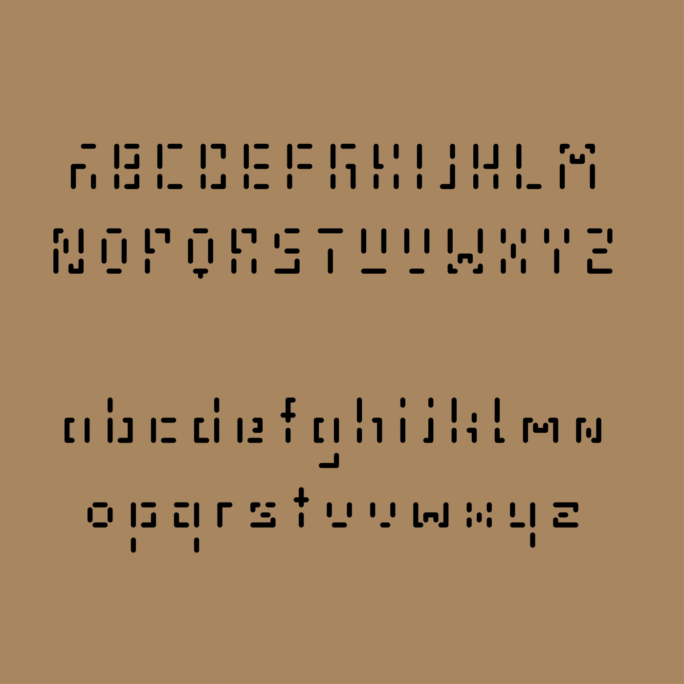
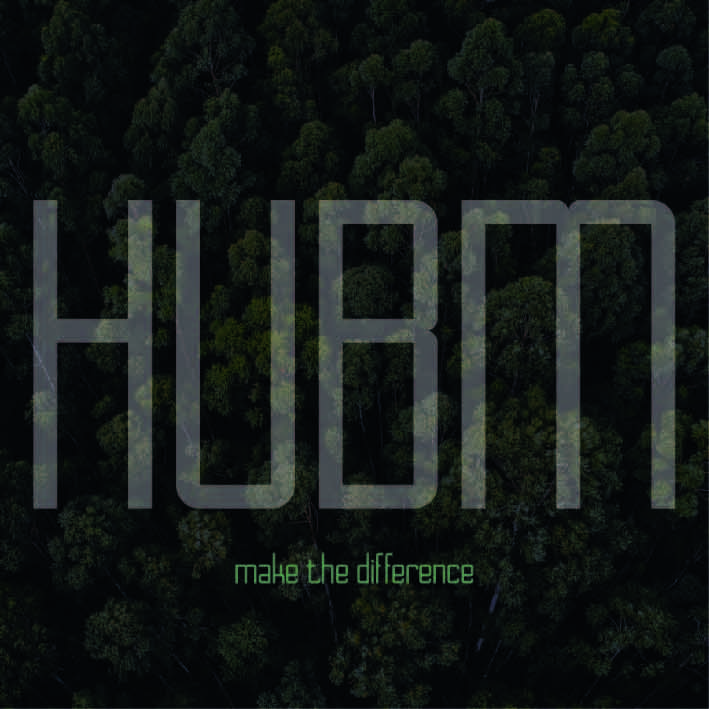
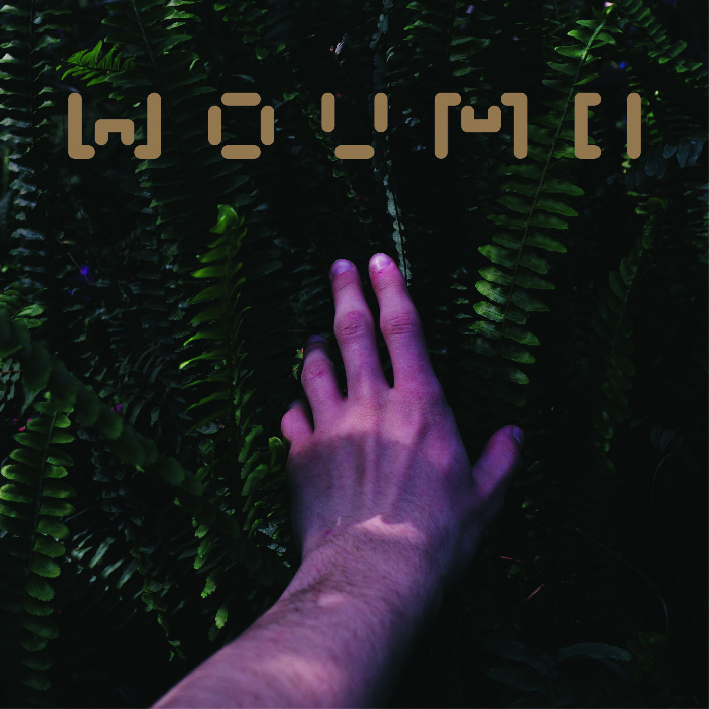
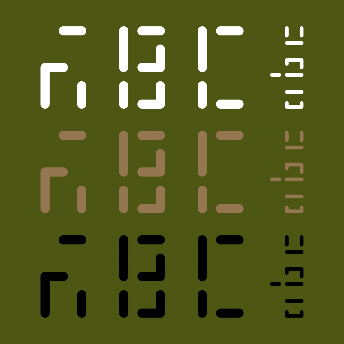


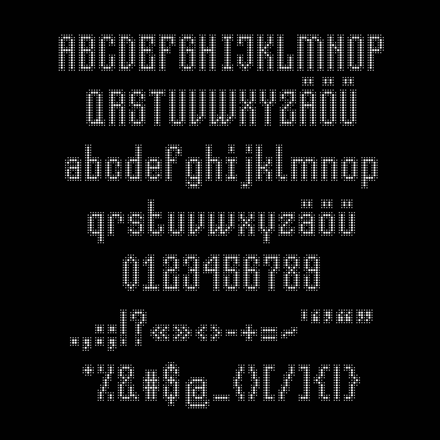
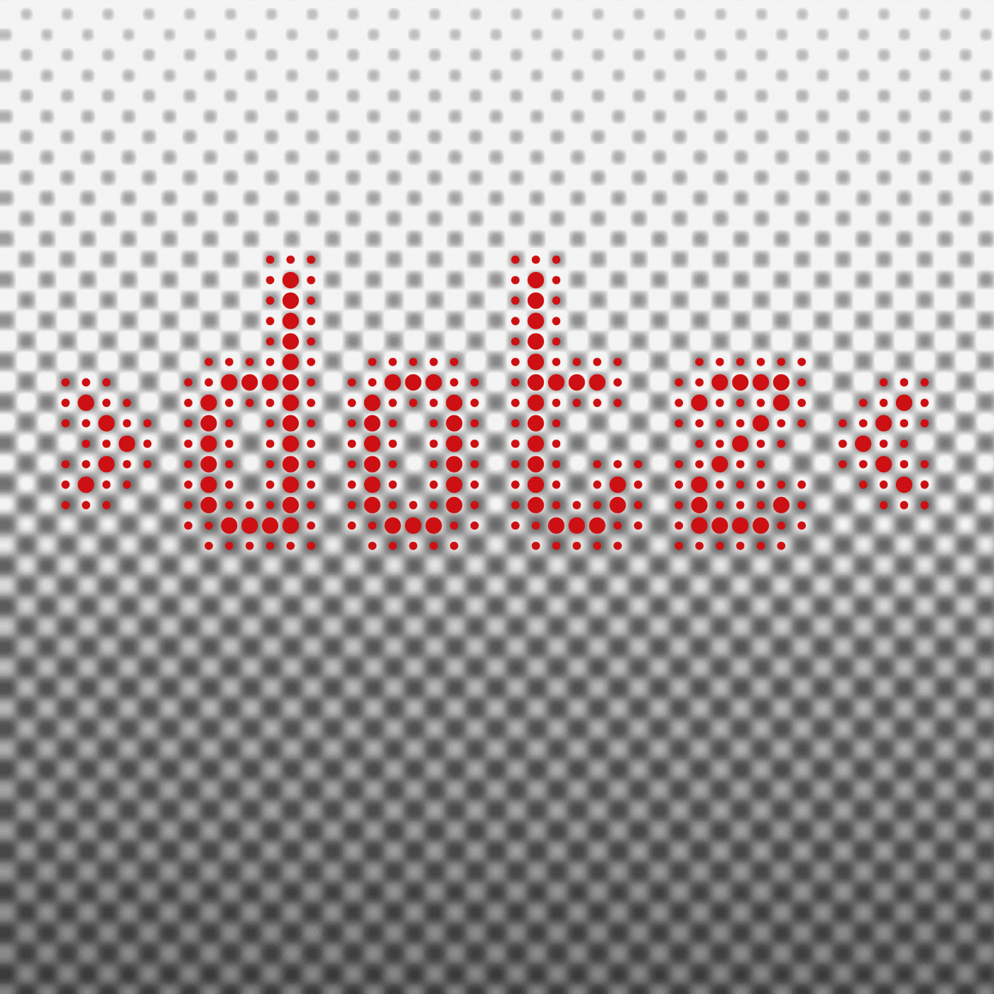
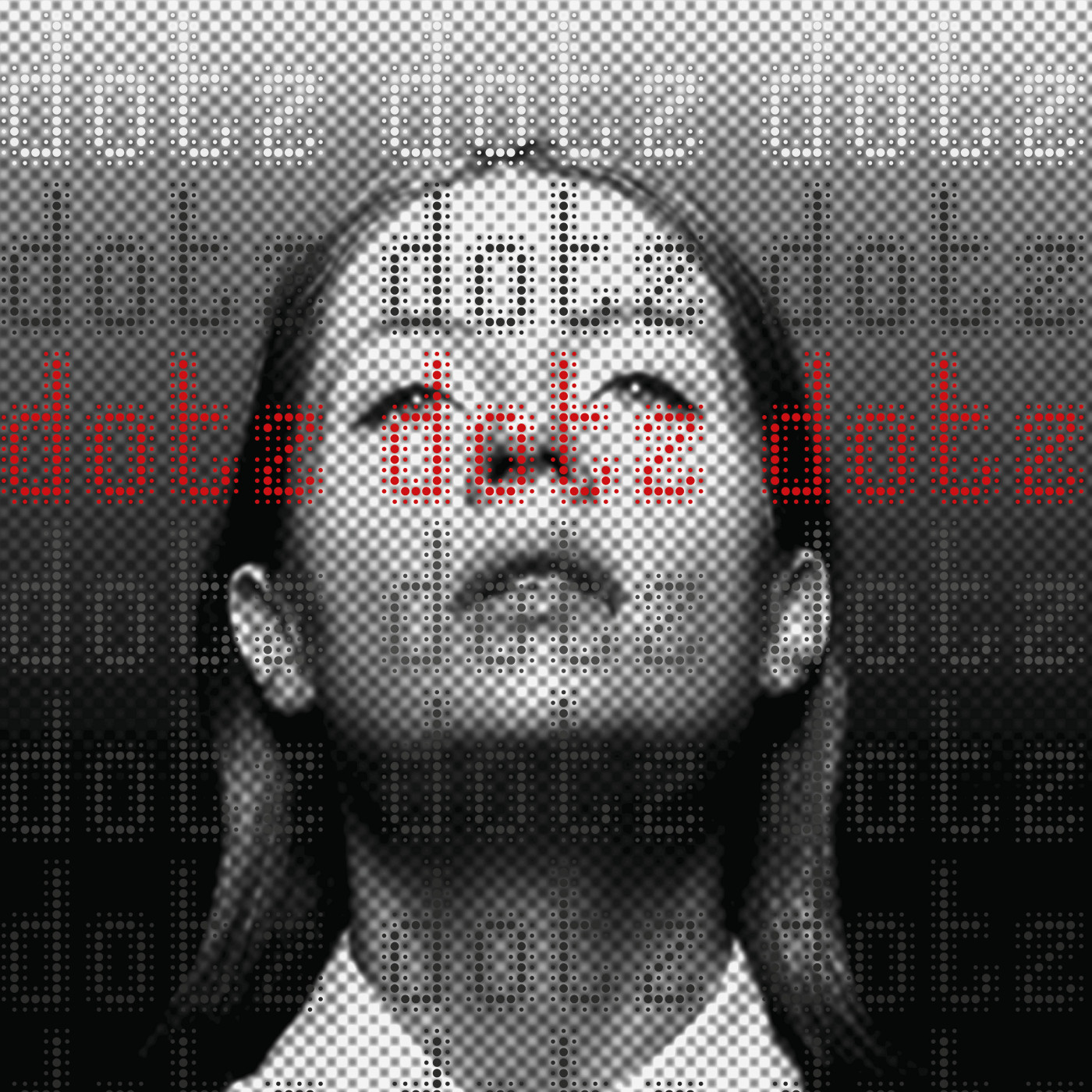

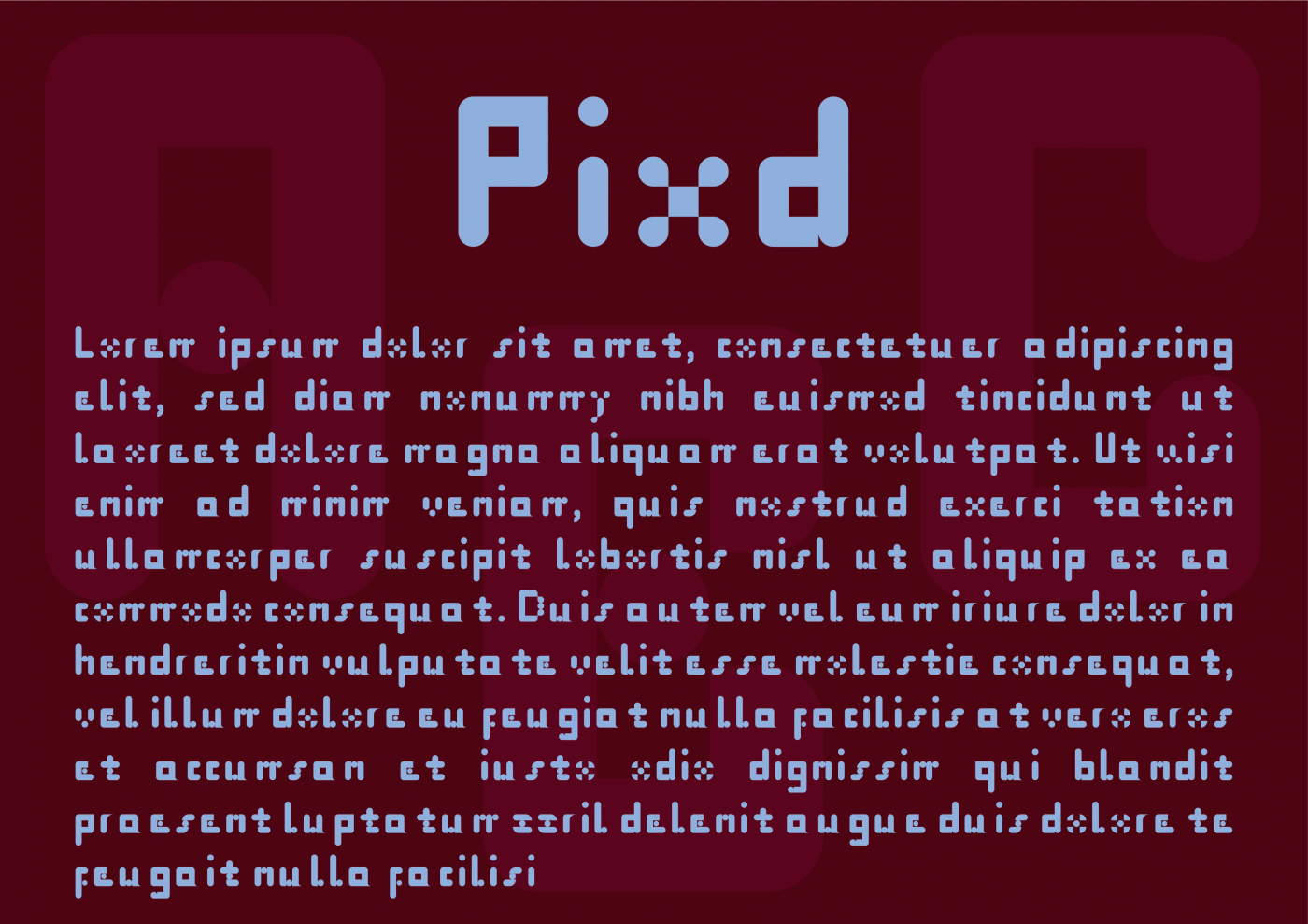


Nice idea and well executed. Your second example shows the best side of the font.
»