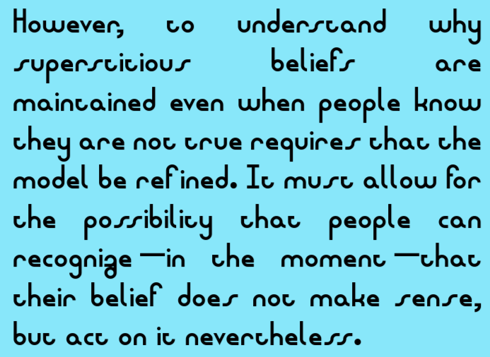
FUN FACT: this is the version of the font used in the "make fonts, not war. нет войне." version of Fontstruct, down to the i (и) being written as u. :)
Like it!
^ I already figured that out recently. The kerning is for misc features that make the font look neater, might have to remove the notice to use
I live in 4
update: cyrillic extended a-d will be added
@Skilgrrr - Unless this design where glyphs merge together is intentional, you can adjust the overall spacing width of each character, as shown in
where's the overhang (like on Q, S, etc.) on J, U, etc.?
wii sports vibes
request: unified canadian aboriginal syllabics
...
You're just too dramatic. PREMIERING IN SPRING
Prrring! Suspense trailer! Vagueness is coming!
You don't know.
Wait... Inanimate Insanity?!
Keep going, follow the feeling.
Thank you Elmoyenique, I think I should have made the strokes thiner, or somehow more variable. Maybe I will get back to it in lower case.
I'm a rough and toughin' cowboy who was looking for a condensed and and spur-ended typeface, and this was perfect for me!
this is so chunky i love it
this is so epic
This is the best font I've ever seen
Awesomesauce
Looks pretty!
Thanks.
@elliqvl By "somewhat", I meant some of the capital letters; the lowercase are more "doing their own thing".
@elmoyenique Said typo is fixed now.
- minidonut (Just 5? Rly)
whoops i didn't mean it :( minidonut's cool
You said English and took a Pan-African letter. Why not Latin letter?
Characters from two different scripts shouldn't be kerned together anyways as it doesn't work correctly very well (not consistant across software)
██, huh? █████ is the actual ███. Left you to impress, @thwiak_███.
Oops, @thwiak_tzlud






FUN FACT: this is the version of the font used in the "make fonts, not war. нет войне." version of Fontstruct, down to the i (и) being written as u. :)
»